Redesign of Checkout Process for HEB Mi Tienda del Ahorro
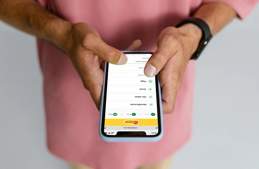
Mi Tienda del Ahorro, part of HEB Mexico, aimed to enhance its checkout process. The goal was to create a more intuitive user experience, reduce the number of steps required to complete a purchase, and minimize cart abandonment due to the complexity of the existing checkout process.

Sector: eCommerce
Platform: Web and Mobile
Project Duration: 8 weeks
Objective
The goal was to simplify Mi Tienda del Ahorro's checkout process, making user purchases more intuitive and reducing cart abandonment.
Tools Used
- Design: Figma (wireframes and prototyping)
- Communication: Microsoft Teams (communication with development team and product owners)

Project Details
Challenges and Objectives
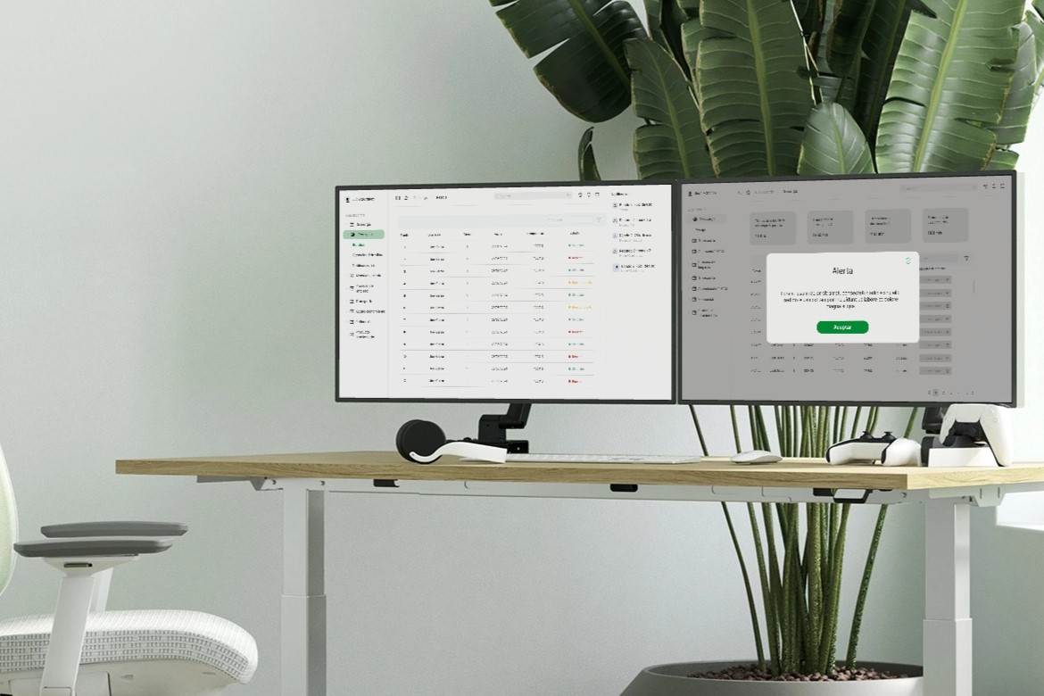
Simplify the checkout process to minimize cart abandonment and create an intuitive experience across web and mobile platforms. Develop a consistent design system with reusable components.
Design Process
- Research Conducted user research to identify pain points in the existing checkout process. Gathered user feedback and performed usability testing.
- Wireframing Created high-fidelity wireframes for desktop and mobile platforms. Defined four main steps:
- Cart Review
- User Information Entry
- Shipping and Payment
- Purchase Confirmation
- Prototyping Developed interactive prototypes to demonstrate the new checkout flow, highlighting key functionalities and interactions.
- Visual Design Implemented a design system using atomic design principles for consistency and reusability. Focused on a clean and modern aesthetic to enhance user guidance.

Key Features
Simplified steps to four main stages, responsive design for desktop and mobile, user-friendly interface with enhanced form fields and error messages, reusable components for easy implementation and updates.
Project Outcome
The redesigned checkout process reduced the time required to complete a purchase, improved user satisfaction, and lowered cart abandonment rates. The design system facilitated a more efficient development process.
Learnings
Gained expertise in atomic design principles, enhanced skills in remote collaboration, and learned the importance of iterative design and testing.
Conclusion
The project highlighted the value of user-centered design in eCommerce. Key challenges included ensuring cross-platform consistency and managing remote collaboration. Future iterations could explore features like one-click checkout. Advice for future projects: prioritize user feedback and maintain close communication with development teams.


