Designed and implemented a Help Center for HEB
In this project, I designed and implemented a Help Center for HEB, aimed at enhancing the customer support experience for their app users. The primary objective was to create a user-friendly, efficient platform where users could quickly find answers to their questions and resolve issues independently. Through thorough user research, design iterations, and a focus on intuitive UI/UX design, the Help Center was developed to streamline user interactions and optimize the overall support process. This case study outlines the research, design, and implementation phases of the project, highlighting the key strategies and solutions employed to achieve a seamless and effective Help Center.

Personas
Based on five informal interviews with users, I created two personas that reflect common user goals and pain points. Users utilize the app to optimize their shopping time, prioritizing speed. Given the varied ages of the users, we aimed to meet the diverse needs of all user demographics.

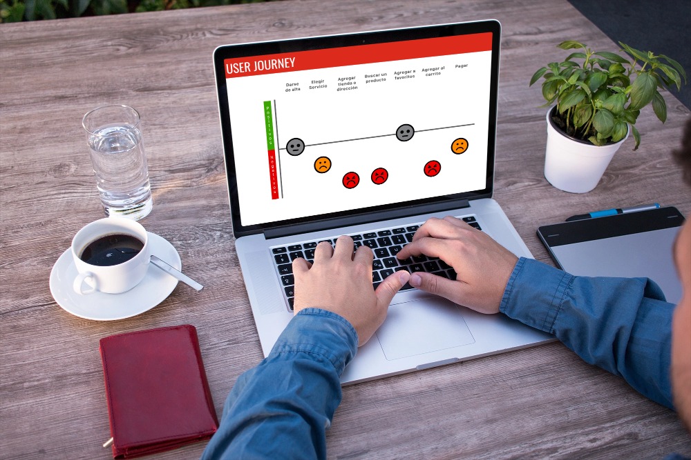
User Journey
I mapped out the users' steps to understand how to simplify their journey and help them achieve their primary goals efficiently. My goal was to optimize user efficiency by minimizing the interactions needed to reach the two main objectives. I designed a user flow diagram to help users understand how the help center functions, enabling them to resolve their queries independently without needing to contact support.

Design Iteration
To enhance the user experience, I implemented changes in three key areas of friction:

1. Change from "FAQ" to Help Center:
The title "Frequently Asked Questions" only covered common queries, without providing a clear view of different areas. By renaming it to "Help Center," we clarified the purpose of the landing page, making it easier for users to navigate and find relevant information.
2. Generate Information Cards:
Designing information cards provided users with a comprehensive view of what they can find in each section. These cards categorized information by themes for better understanding and easier access.
3. Refined UX Copy:
To give users clearer context about the stored information, we provided more detailed information on each topic. This helped users understand the content better and find answers more quickly.
UI Design
Aiming to capture the spirit of efficiency and clarity, I crafted a visually bold and energizing design. The page is designed to provide users with all the information they need to resolve their doubts on various topics. This feature addresses the previously noted usability gaps, allowing users to explore and find answers independently.
Conclusion

What did I learn from this project?
Through this project, I learned the importance of user-centered design and how crucial it is to understand user needs and behaviors. The experience taught me how to effectively translate user feedback into actionable design improvements, resulting in a more intuitive and efficient help center.
What were my biggest fears, challenges, and struggles
One of my biggest fears was whether the new design would effectively meet user needs and improve their experience. I also struggled with ensuring that the information provided was comprehensive yet easy to navigate. Overcoming these challenges involved continuous user testing, gathering feedback, and iterating on the design. Being honest about these challenges made me more aware of my design choices and helped me grow as a designer.
By reflecting on these aspects, I have become more conscious of my design process and more confident in my ability to create user-centric solutions.
If you're looking for a UX/UI designer who can create intuitive and engaging user experiences, I'd love to collaborate with you. Let's work together to bring your vision to life. Contact me to discuss how we can make your next project a success!


